Near Nature, Near Beauty -> near:graden
New Brand Identity
New Brand Identity
near:garden is a lifestyle skincare brand that takes care of its own clean and beautiful nature away from the polluted city center. But these 'natural skincare brands' are very common brand concepts. That's why it's important to define "near:garden's Nature" We targeted it and formed a differentiated image from other brands with this differentiated nature definition.
니어가든은 라이프 스타일 스킨케어 브랜드로 오염된 도심을 벗어나 깨끗하고 아름다운 자신만의 자연을 찾는 브랜드입니다. 그렇지만 이런 '자연 스킨케어 브랜드'는 너무나도 흔한 브랜드 컨셉입니다. 그렇기에 '니어가든 만의 자연'을 정의하는 것을 목표로 삼았고 이런 차별화된 자연의 정의로 타 브랜드와 차별화된 이미지를 형성했습니다.


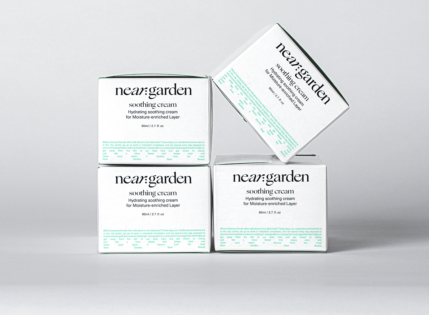
near:garden's logo represents a gradual approach to nature by varying the slope of each spelling of near, and the angles above range from 0 to 30 º. In addition, the reactive symbols represent the appearance of the n, g, and r spelling of the near:garden gathering toward ':', similarly approaching nature.
니어가든의 로고는 near의 각 스펠링의 기울기를 달리하여 자연으로 점점 다가가는 모습을 형상화 하였고 위의 각도들은 0º에서 30º입니다. 또한, 반응형 심볼은 니어가든의 n, g, r 스펠링이 ':'을 향해 모이는 듯한 형상으로 마찬가지로 자연에 다가가는 모습을 형상화 했습니다.


the definition of city and nature
The general definition of nature focused on delivering a clear and clean image of green light, but Neargarden thought that these ordinary images of nature were not enough to convey Neargarden's own image. So we've transmitted images in different directions, and the other direction is from bringing entropy concepts in physics I made it. Entropy is a word that means disorder, and the increase in entropy in physics is natural By explaining it as direction, it explains that the state of order is natural, that is, artificial and disorder.
일반적인 자연의 정의는 녹색빛의 맑고 깨끗한 이미지를 전달하는 것을 중점으로 만들었습니다. 하지만 니어가든은 이런 평범한 자연의 이미지로는 니어가든만의 이미지를 전달하기에는 부족하다고 생각했습니다. 그렇기에 다른 방향으로 이미지를 전달했고 다른 방향은 물리학에서 엔트로피 개념을 가져오는 것에서 만들었습니다. 엔트로피는 무질서함을 뜻하는 단어로 물리학에서 엔트로피가 증가하는 것이 곧 자연적인 방향이라고 설명함으로 정돈된 상태가 곧 인위적, 무질서함이 자연적이라고 설명하고 있습니다.


Graphic Type 1
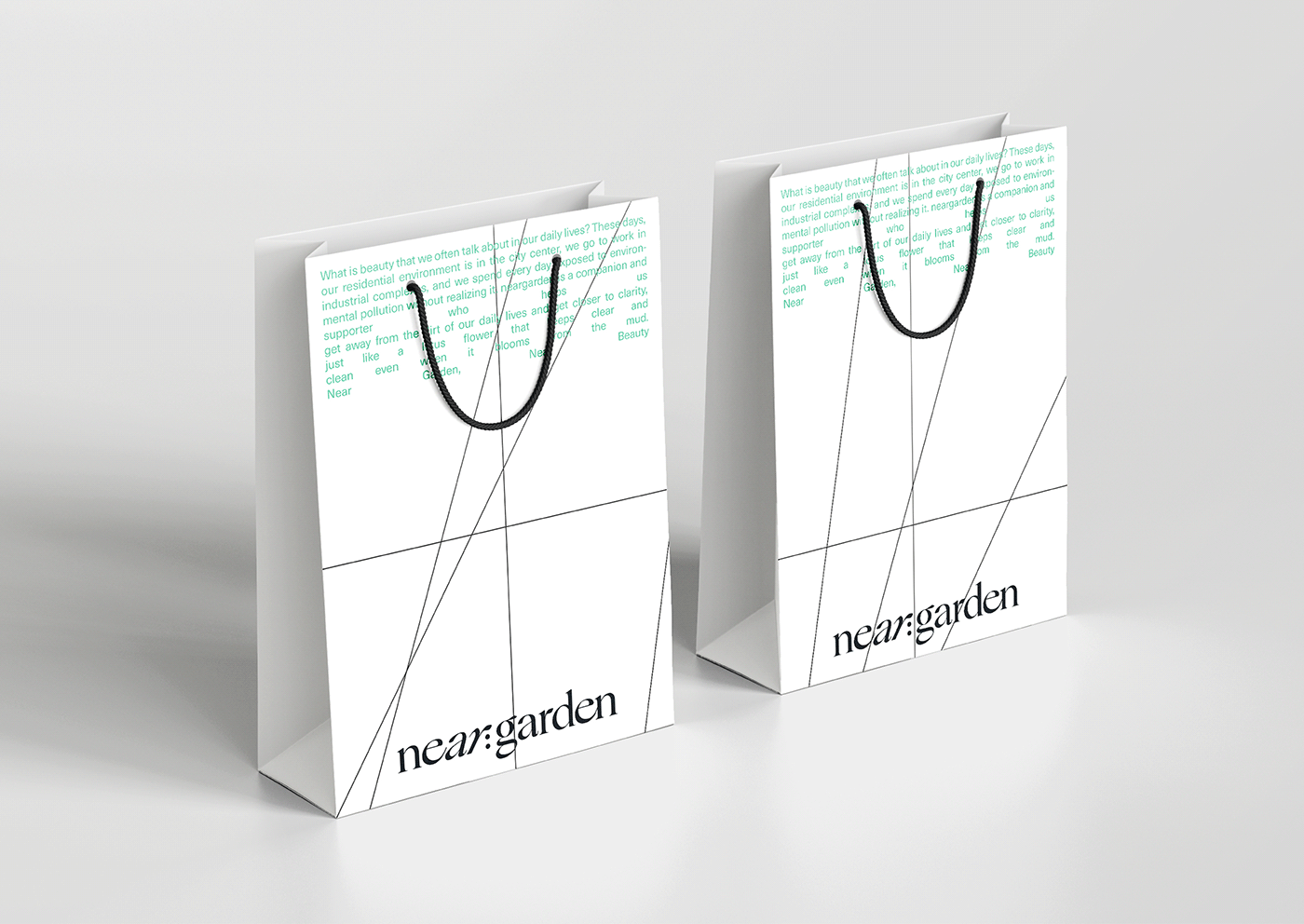
near:garden's first graphic was modeled after the diversity and disorder of nature, with lines of width from 0 to 30º We put a vertical straight line that symbolizes the earth to set 12 areas, and the line moves according to the area to complete a graphic of various but disordered but also modern but complex images.
니어가든의 첫번째 그래픽은 자연의 다양함과 무질서함을 본따서 만들었습니다. 0º에서 30º의 가로의 선과 대지를 상징하는 세로의 직선을 넣어 12개의 영역을 정한 뒤 그 영역에 맞춰서 선이 움직이는 것으로 다양하지만 무질서한 또한 모던하지만 복잡한 이미지의 그래픽을 완성시켰습니다.


Graphic Type 2
near:garden's second graphic is a photographic graphic, which we use over a large area. When we look at an object, we're used to it if it's in the right direction It feels stable, but the more the angle is twisted, the more unstable it becomes. Using this graphic, four pictures from 0 º to 30 º are evenly distributed It was left constant in the area, and it expressed a gradual approach to nature.
니어가든의 두 번째 그래픽은 사진을 이용한 그래픽으로 넓은 면적에서 사용하는 그래픽입니다. 우리가 어떠한 물체를 볼 때 물체가 정방향이면 익숙하기에 안정적으로 느껴지지만 각도가 점점 틀이 지면 틀어질수록 불안정감을 느낍니다. 이것을 이용한 그래픽으로 0º에서 30º까지 틀어진 4가지 사진을 균일하게 분등이 된 영역에서 일정하게 놔둬서 점점 자연에 다가감을 표현했습니다.